Poster Designers - A.M Cassandre
Adolphe Jean Marie Cassandre, also known as A.M Cassandre was a French painter born in 1901 and died in 1968. He was raised by his French-speaking family in Paris after moving there with his family when he was 14 years old in 1915. He was born in Kharkiv, Ukraine. He pursued his artistic education at the Lucien Simon and l'Academie Julian-owned independent studio, Ecole des Beaux-Arts. After completing his studies, he opened his own studio on Montparnasse's Rue du Moulin-Vert in 1922. He was also a painter, stage designer, poster designer, lithographer, and graphic artist. He drew inspiration from the cubist and surrealist traditions.

"Nenyto" by A.M. Cassandre was created in 1928. The style of art this poster follows is Art Deco. The poster was done for the 1928 Dutch exhibition and is one of the rarest posters he has made. I like the use of how he has the smoke coming out of the towers giving it a realistic look.
PHOTOSHOP PRACTICE
For this image, I used a picture from Google of a table and used a picture of a crutch. Then in Photoshop, I took the legs off the table and then added the crutch to the table. I took the top bit off the crutch to make it actually look like a table leg. Then when I did that I rotated the crutches on the right side to be facing the left. Then I used the smudging tool to make the crutch look attached to the table.
Batory
Michal Batory born in Lodz, Poland, in 1959, is one of the most celebrated contemporary poster artists, and a recipient of many awards in the field of graphic design. He lives and works in Paris. He is a master of illusion, skilfully juggling everyday objects and combining various motifs to create a new range of peculiar objects. His thought-provoking works pluck us out of the often bleak imagery that numbs our ability of active perception. Batory presents us with questions, rather than answers, reflection instead of weariness, and idealism in the place of mundane reality. No matter if it lasts only a brief moment. He is one of the most respected poster designers in the world. He creates graphic design for prestigious theatres, centres and cultural institutions. I like this image because Batory has used Photoshop well to make the cactus as the fingers. He has done a very good job of blending the fingers into the cactus and making it look like the fingers and the same shape too.
Exposure Theory's

F
or this shot, I set the shutter speed to nearly the highest it could be which meant that I had to put the aperture lower and the iso to be less sensitive. The shooting mode I used was manual so I could experiment with each different one and see how to use the camera settings I had available and modify the image as well as possible. I can also see that when I decrease the aperture the background goes blurry and it increases the focus of the light bulb.
In this shot, I set the shooting mode to manual so I had full control of all 3 camera settings. I put the shutter speed all the way to the lowest and then I put the aperture to near the lowest to make it darker but make it still so you can still see the image pretty clearly. I also set the ISO to the lowest to make the image a bit darker as well.
For this shot, I wanted to make this the darkest you could make while it still being visible. For this to be possible, I chose the shooting mode manual so I could have control of all the camera settings. I put the shutter speed to one of the fastest it could be and the aperture to the most narrow. This meant I had to have the ISO to more sensitivity because if the ISO was lower it would mean that the bulb wouldn't be visible and the image would just be fully black.

For this shot, I wanted to make the shot as bright as I was able to. For this to happen I had to use the manual shooting mode so I had control of all the camera settings. I first set the ISO to the most sensitive it could be because I knew that the higher the ISO number was the brighter the image would end up being. Then I changed the aperture to its highest and the shutter speed to one of the slowest. It also could have worked if I put the shutter speed to the fastest and then the aperture to where the shutter speed is on this image. Because of this, this is the brightest the image can be without it becoming a whole white screen.
 For this shot, I set all the camera settings to the highest number they could all possibly be. The shutter speed is the fastest it could possibly be, the aperture is the most narrow and the ISO is the most sensitive it could be. This meant that there was a sort of dark image to the photo and the image was also quite blurry.
Camera Basics
ISO, which stands for International Organisation for Standardisation, sets the standard for measuring the sensitivity of film and digital image sensors to light. A higher number indicates a higher sensitivity to capture light, and a lower number indicates a lower sensitivity to light.
Shutter speed is the amount of time it takes for the camera's shutter to close. Shutter speed is measured in seconds or fractures of a second. A fast shutter speed gives a shorter exposure, while a slow shutter speed gives a longer exposure.
The aperture is the section of the camera that is adjusted to let in more or less light. It is typically measured in F-stops. Smaller f-stop numbers indicate a larger aperture opening while larger f-stop numbers indicate a smaller one.
Depth of field refers to the distances between the nearest and furthest elements in a scene. When a photo has a shallow depth of field, only a tiny portion of the image is in sharp focus, while the areas in front and behind appear blurred and photos with a deep depth of field result in a more significant portion of the image being in sharp focus.
White balance refers to the adjustment of colours in a vision to ensure that white objects appear truly white, regardless of the lighting conditions under which the photo was taken. White balance helps correct and maintain the accurate representation of colours in a photograph, so they appear natural and not skewed by the colour temperature of the lighting.
Frame rate refers to the frequency of which number of still images or frames that are displayed. Frame rate is usually expressed in fps.
Focus modes refer to the different ways in which a camera can automatically or manually adjust its focus to ensure the image appears sharp and clear.
Composition in Photography
The rule of thirds is a composition guideline that places your subject in the left or right third of an image, leaving the other two-thirds more open.
Leading lines are a compositional technique in which lines are used in a photograph to direct the viewers' attention to the main subject of the image.
Symmetry in photography is achieved when two halves of an image hold the same weight and give a perfect balance between the two sides of your photograph.
The depth of field in a photo refers to the distance between the closest and farthest objects that appear acceptably sharp.
The viewpoint refers to the position we take the photograph from. This will also be the position you place the viewer in when they are looking at your finished shot.
Bird's eye view is a viewpoint in photography where the picture is taken from above.
Worm's eye view photography is a type of photography that is taken from a low angle, looking up at the subject.
Audience theory's
HYPODERMIC SYRINGE THEORY
The hypodermic syringe theory is a theory that suggests that media messages are injected directly into the brains of passive audiences. The theory argues that media messages are like a drug injected directly into the audience's mind, changing their mind in negative ways. Members of society who are impacted by this theory can be vulnerable and easily convinced about what they see on their phones or on the TV. If a news program presents a biased or misleading report on a political view, the theory suggests that the viewers will believe it as the truth. This could also happen with products, people may see a product that could be false advertising however they might see the product and buy it and be very disappointed when they actually get it.
CULTIVATION THEORY
The cultivation theory is a social theory that explains the long-term effects of media on people who are exposed to it for a long time. According to the theory, the amount of time someone spends on media and consuming the information that they see, the more likely they are to believe what they are seeing in front of them and present that media as a reality. On TV, there is a lot of news about crime and violence, so someone who watches the news a lot may think certain areas are very dangerous and crime-filled and much more common than it really is. An example of the cultivation theory could be someone who watches a lot of crime and drama series. This could lead to them believing that the world is full of crime and that it's very dangerous. This could lead to them not wanting to go out or when they do go out they could feel very feared as they think in this way.
TWO-STEP FLOW THEORY
The two-step flow theory is a communication theory that believes that most people who consume media form their opinions from opinion leaders, who are influenced by media. According to this theory, individuals within a social group or community are considered opinion leaders. They actively consume and engage with media, such as newspapers, radio, or television, and they form their own opinions and interpretations of the information presented. The opinion followers are then misled and believe what the opinion leaders say and get incorrect or biased information. An example of the two-step flow model is in marketing and advertising. Businesses contact opinion leaders in this situation to market their goods and services. This is accomplished via a range of marketing strategies, including sponsorships, product placement, and endorsements.
USES AND GRATIFICATIONS THEORY
The uses and gratifications theory suggests that the individuals who consume the media have the power and choice to select what media they choose to watch or read for their own satisfaction. They believe that the uses of different types of media can be put into 4 sections. Personal identity, Information, Entertainment, and Social interaction. This theory emphasises that people actively choose media content that meets their psychological or social requirements rather than perceiving viewers as passive recipients of media messages. For example, media is used by people for amusement. For relaxation and an escape from their everyday routine, they watch films and TV shows or listen to music. The demand for social interaction can be satisfied by media.
Digital Image types
Resolution affects image size by determining how many pixels are packed into a given area in an image. A higher resolution has more pixels, meaning that when you print or display it, the image will be more detailed and appear much sharper. This will result in a larger file size as there are more pixels. Lower resolutions have fewer pixels, meaning that it will appear less detailed and look a lot more pixelated when it's enlarged. This means that they will have smaller files as there are fewer pixels on the screen. Resolution directly affects image size in terms of its digital dimensions and its physical dimensions. The resolution determines the number of pixels packed into an image. Higher resolution means more pixels meaning that there will be a larger image size on the screen. This means that resolutions can affect the image quality and image size on the screen depending if it's lower or smaller.
JPEG, which stands for Joint Photographic Experts Group, is a graphic image file that uses lossy compression to compress images for more convenient storage and sending. JPEG is designed for compressing and storing digital images, photographs, and images with more colour and tone variations. However, JPEG is not good for text and sharper images.
PNG, which stands for Portable Network Graphics, is a raster image file type. It's popular due to the way it can handle graphics with transparent or semi-transparent images. It is commonly used for web graphics, icons, logos, images with transparency, and images that require precise colour rendering. It has become a standard image format that must balance good image quality with reasonable file sizes.
GIF, which stands for Graphics Interchange Format, is commonly used on the web to display graphics and logos. GIFs are also known for its support of animations and simple graphics. They have been a popular format on the internet for different purposes such as memes, animations, avatars, and simple decorative elements on websites. They allow images and frames to be combined, creating basic animations.
SVG, which stands for Scalable Vector Graphics, is a popular tool for presenting 2D graphics, charts, and illustrations on websites with precision and scalability. It can be scaled up and down without losing any of its resolutions. It's commonly used for a variety of purposes, including web graphics, logos, icons, illustrations, charts, and diagrams. It's used especially in web design and development for creating responsive and scalable graphics that adapt to different screen sizes and resolutions.
JPEG is used for photographs and images with complex colour gradients, and PNG is used for images with transparency, sharp edges, and text. GIFs are used for simple animations and graphics with a limited colour palette. SVG for vector graphics, logos, icons, and images that need to be scaled without loss of quality for interactive graphics.
Formal elements of photography
TEXTURE
The texture is the surface quality of an object as captured by the camera. It involves the visual and the perception of details of details such as roughness, smoothness, or patterns in the subject. Photographers often use texture a lot to add interest, depth and a tangible feel to the image which enhances the image.
PATTERN
Pattern is the repetition of elements, such as shapes, colours, or objects, in a visually pleasing way. Photographers often use patterns to create interesting compositions, adding a sense of rhythm and order to their images.
LINE
 Line is the use of lines to create a visual interest to convey a message in a photograph. They contribute to composition, leading the viewer's attention and creating a sense of movement or structure within the photograph.
SHAPE

Shape is the two-dimensional outline or form of an object. Shapes can be geometric or organic. Photographers use shapes as fundamental building blocks in composition, arranging them to create visually interesting and balanced images.
COLOUR

Colour is one of the main tools a photographer can use to create mood in their images. Colour conveys mood and enhances visual impact. Photographers often use colour theory to create compositions.
TONE
Tone is the distribution of light and dark areas in an image. It contributes to the overall mood and atmosphere. Photographers may manipulate tone during editing to enhance contrast or create a different aesthetic.
FORM
Form is the three-dimensional appearance of subjects within a two-dimensional image. Photographers use lighting and shadows to emphasize the contours and shapes of objects, creating a sense of depth and solidity.
Light in photography
 The key light is the main source of light in a video or photo. This light is most often placed to one side and directly pointed at the main subject of the photo/video.
The fill light brightens the shadows cast on your subject by the key light. It could be as important as the key light. Fill light is often used to light up the shadowed parts of your setting. It reduces contrast and increases details.
 Hair light focuses on a source of light exclusively on the hair of the model. The main purpose of this is to make the hair look more glossy and defined. The light is only meant to fall on a small part of the subject. The light beam is narrow so it can focus on a small part and won't hit a large part of the subject. The closer the light is to the subject, the more narrow the highlight. If you want the light to hit a larger area of the subject, you have to move the light further away. The light is meant to help the subject stand out from the background and make it for the viewer to look in that way of the image.
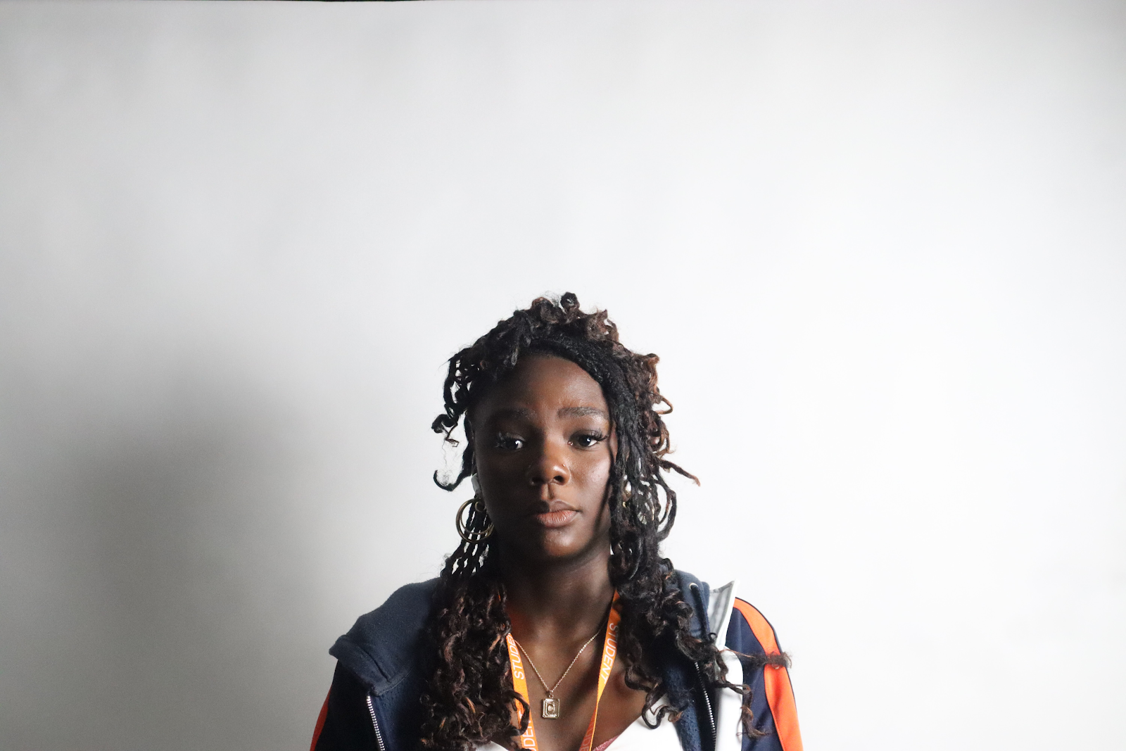
The background light is used to illuminate the background area set. The background light is placed last and is usually placed and is usually placed directly behind the subject and pointed at the background. They can also help eliminate shadow casts on the backdrop by the subject. The light is most often dimmer than or equal to the power of the key light.
Camera-mounted flash means you can quickly move around within crowds in popular places such as festivals concerts and more. You can also swiftly change the direction the flash is set off in very easily. The flash can be bounced off the ceiling to diffuse the light before it hits the subject.
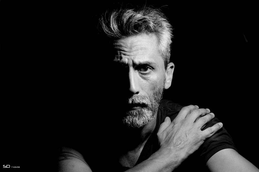
Split lighting is a lighting technique that lights up half of the person's face while leaving the other half shadowed. The side lighting emphasises the texture of the skin and the details of his face. This creates a dramatic effect. It's sometimes used to create a sense of mystery.
Rembrandt lighting is a specific lighting technique that utilises one light and one reflector or two separate lights. It creates images that look dramatic and natural. Rembrandt lighting is characterised by a small, triangular area of light that falls on the person's cheek on the side of their face while facing the camera.
Loop lighting is a lighting pattern that creates a circular shadow on the person's face right under the nose. It's named for the specific pattern of light it creates on the person's face, which resembles a loop or a curved shadow. It adds dimension and a flattering quality to the photograph.
Butterfly lighting is a portrait pattern where the key light is placed above and directly centred on the person's face. It's commonly used for portraits It creates a shadow under the person's face which then resembles a butterfly. A reflector can be used to fill in shadows or create a lighting effect.
Broad lighting is a lighting technique that lights up the broad side of the subject's face in front of the camera. The technique is called broad because it makes the illuminated side of the face appear larger or wider in the frame. It provides flexibility and can be adjusted to suit the characteristics of the person in the photograph.
Light and photography
Rembrandt lighting
butterfly lighting
Type of fonts
A sans serif is a type of style that does have any serifs. These typefaces are often considered modern and straightforward, making them popular for digital displays and contemporary design.
A serif is a small line that is added to a letter in certain typefaces. Serifs can take various forms, such as bracketed serifs, slab serifs, and more. Serif fonts are often associated with a more traditional, formal or classic appearance.
Slab serif is a serif font where the serif is squared off, giving it a blocky look. These serifs are prominent and exhibit a strong, straightforward design.
Engraving helps us add a personal touch to any life event. These fonts are crafted to convey a sense of precision and elegance, making them suitable for applications like plaques, awards, jewellery and other items where a classic, engraved look is desired
The handwritten script is a loose genre classification of typefaces, resembling a handwritten style. Handwritten scripts often showcase the unique characteristics of a person's handwriting, adding a personal touch to the content.
Photographer research
Frans Lanting is a renowned Dutch wildlife artist photographer for National Geographic. and environmentalist known for his images of nature and wildlife. His work often focuses on portraying the beauty of the natural world and the need for conservation. He's received multiple awards for his work towards the field of photography and conservation efforts. He is also considered one of the greatest photographers of all time. His work has been credited for making people aware of problems all around the world, becoming a catalyst for non-governmental and governmental actions to find solutions. He is also celebrated for his ability to tell compelling visual stories through his images, showcasing the wonders of the planet and raising awareness about environmental issues.
I chose this image because Lanting has done really well with the camera angle making it so you can see the trees, elephant, river, sunset and all the animals in the background. I like how he has chosen an angle where you can see the reflection of the elephant and the tree to have a nice reflection in the pond making the picture look even better. The background is very nice as the sunset is a very beautiful colour and very satisfying to look at.
Steve McCurry is a renowned American photojournalist, born on February 24 1950, who gained a lot of popularity after his iconic photograph "Afghan Girl". His work captures powerful and evocative moments from around the world, reflecting the human condition and diverse cultures. He has photographed many times for the National Geographic. McCurry has gone on to create many images in nearly every continent and many many countries. After travelling all around the world, he has continued to cover armed conflicts including many different wars including the Iran-Iraq war, the Gulf War and the Afghan Civil War.
I chose this image from Steve McCurry because it shows what children have to go through when they are at war. He shows the world the struggles of these children when they are at war. This makes us all feel bad for them when we do end up seeing the photographs as we end up feeling really bad for the child as they a going through a rough time as they have been brought up in a worn torn country.
Sebastião Salgado is a Brazilian social documentary photographer and photojournalist. Renowned for his powerful black-and-white images, his work focuses on issues of global concern, including poverty, migration, and environmental degradation. He is also an advocate for social and environmental causes. He has travelled to over 120 different countries for his projects.
I like this picture because of how there is a lot going on with the animals and the background and the mountains and everything. Also, the way he can use black and white images and make them look really good.
Legibility and colour systems
Legibility is the quality of being clear, easy to read and understandable. In many contexts, legibility can apply to written or printed text, design elements, or even clarity of communication. In typography, legible fonts and appropriate spacing contribute to text legibility. In a broader sense, clear and straightforward communication, whether through writing, design, or spoken words, enhances overall legibility, ensuring that information is easily comprehensible to the audience. The legibility of a website or application is influenced by factors of choice, contrast and responsive design.
RGB which stands for Red, Green, and Blue - are the three primary colours of light used in digital devices to create a wider spectrum of colours. In the RGB colour model, different intensities of these three colours are combined to produce a broad range of hues. The RGB model follows the additive colour theory, where combining fully saturated red, green and blue light creates white light, and combining no light results in black. It's a fundamental concept in digital imaging and colour representation.
CMYK which stands for Cyan, Magenta, Yellow, and Key (black). It is a colour model used in colour printing, particularly in the four-colour printing process. Unlike the RGB model used for digital displays, CMYK is a subtractive colour model, meaning colours are created by varying percentages of light-absorbing cyan, magenta, yellow and black inks. The "key" component is added for depth and to improve contrast. When you combine fully saturated cyan, magenta, and yellow inks, you get black. However, due to practical limitations in printing, black ink is added to ensure richer blacks and more accurate colour reproduction. This model is essential for producing full-colour images in print, including newspapers, magazines and other printed materials.
IDEAS FOR AN EVENT
PRESENTATION
Fashion Photography
Fashion photography is a genre of photography that focuses on capturing clothing, accessories, and style in a visually compelling and artistic manner. It often involves collaboration between photographers, models, stylists, and designers to showcase and promote fashion trends, brands, or individual pieces through images.
Editorial photography is a style of photography that involves capturing images to accompany a story or convey a specific message in magazines, newspapers or online publications. It focuses on documenting real-life events or portraying subjects in a narrative context.
Advertising photography is a specialised branch of commercial photography focused on creating compelling and visually appealing images to promote products, services, or brands.
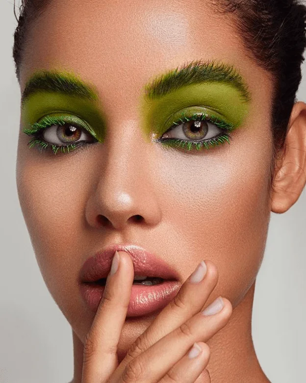
Beauty photography focuses on capturing visually appealing images of individuals, emphasising their facial features, expressions and overall attractiveness.
Hard light is the lighting conditions where the shadows have well-defined, sharp edges. It is produced when a strong, direct light source, such as the sun or a focused artificial light. Hard light creates distinct and prominent shadows, emphasising the textures and details in a scene
Soft light is characterised by a diffused and gentle illumination that produces soft, gradual transitions between highlights and shadows. This type of lighting is achieved with a large and indirect light source such as an overcast sky, diffuser or a softbox
To set up a fashion photography studio you have to choose a room with a lot of space with plenty of light or invest in quality studio lights for illumination. You also need a high-quality camera to capture the inner details of the clothing and accessories. You could also use tripods for stability and mounts for lighting and accessories such as reflectors and diffusers to get a nice look.
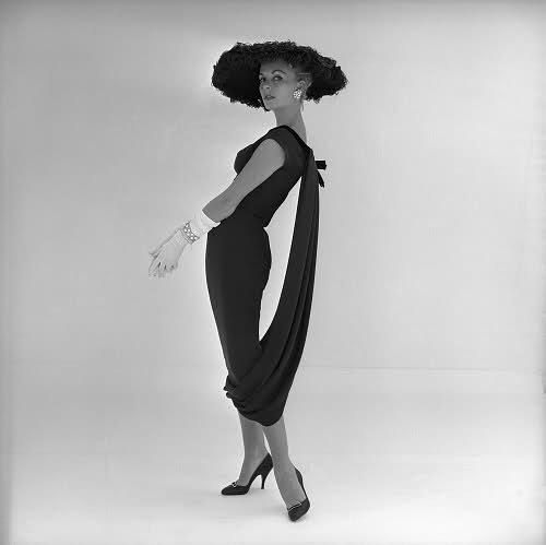
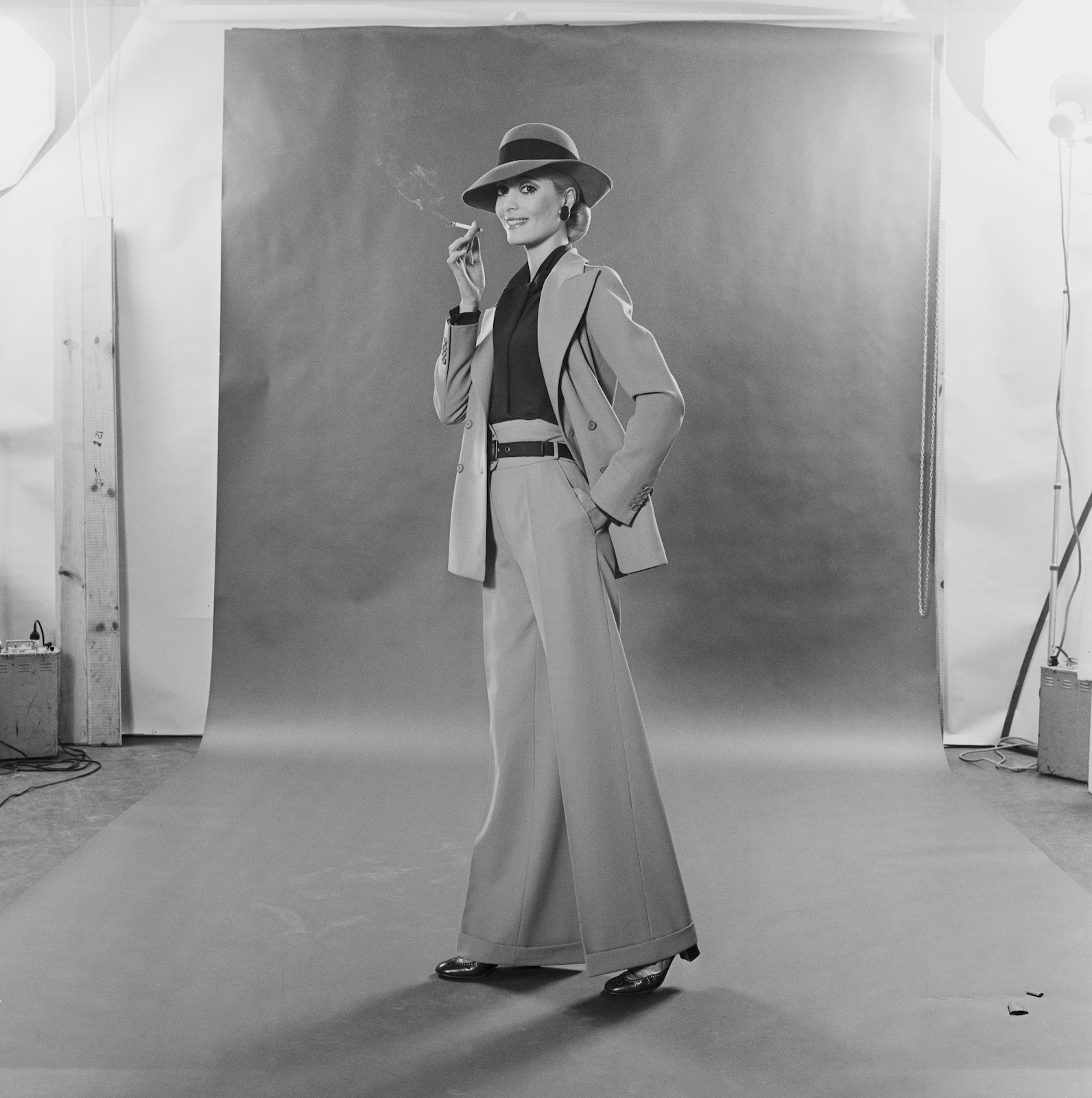
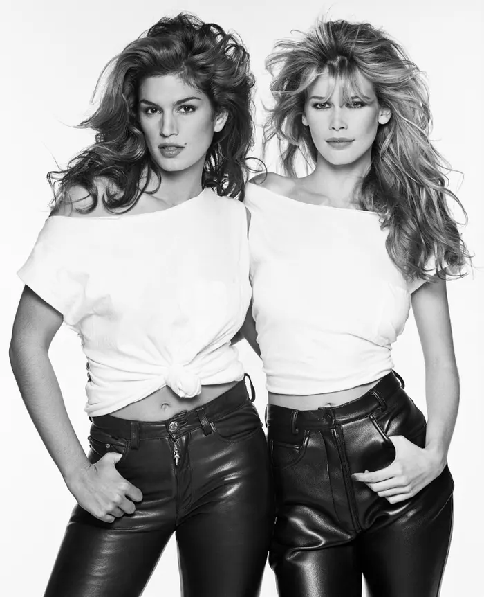
From the 1950s to now, fashion photography has seen a remarkable transition that reflects changes in culture, technology and aesthetics. In the 1950s, black and white photography was used frequently in studios to capture the glamour and elegance of the time. In the 1960s and 1970s, formality was abandoned in favour of more spontaneous and dynamic images that reflected the sifting cultural environment. The 1980s brought boldness and lavishness, reflecting the extravagant lifestyle at the time. In the 1990s and 2000s new creative opportunities arose with the introduction of colour photography. From the 2010s to now, social media platforms democratised the industry, allowing for a broader representation of beauty and fashion.
1950s
1960s
1970s
1980s
1990s
2000s
2010s
2020s
My aim for this poster was to create a football activity for teenagers who like football. I did this because I know that a lot of teenagers like football and they will really enjoy something like this so I did it. I did have a plan and I had a rough idea of what I wanted to do. I mostly followed it, however I did change it up so I could have a much better poster. To create both my posters I used Photoshop. This is because I know a little about photoshop and how to use it. For the graphic poster, I really was just doing trial and error. I was testing out different ideas and seeing what I liked more then I found something that I really liked and kept it like that. For the photographic poster, I also used photoshop because I knew that I wanted to create the similar style of poster for both so I just kept it simple and had a similar poster for my graphic and photographic. For my research, I used a a lot of primary and secondary research. With this research I saw that a lot of teenagers around 13-17 are really interested in football and playing competitively. This gives them a chance to prove themself as it is really hard to get into a actual football team so this could really help boost their confidence and reputation for themself. The research helped me finish this poster because I found out that teenagers are very interested in football and they would love a tournament that involves a good amount of cash for the winner. For my problems I had a few. One of my problems were that for my ideas I did not have a rough idea of what I had wanted to do. This really was a big problem because it gave me less time to focus on my poster as I was only focusing for my ideas however once I had got an idea I knew what I wanted to do and it didn't take me long to make a poster. In my opinion, I think that my poster went well, this is because I really liked all the designs and how it is structured. I think it looks a bit basic however I believe it is a good poster. I think that it communicates my ideas really well because it has every bit of information on the poster and it is very clear about what it is as well. In my opinion, I think that I could of changed the photographic poster because it does look very dull and unfinished too. I think this is because I spent a lot of time on the graphic poster, not knowing what I wanted to do and when it came to finishing I didn't have a lot of time to complete the photographic one as I had spent a lot of time on the graphic poster. If I was to repeat the process again I would definitely focus more on time management as I don't think I really had control of what I had to do and some of it looks a bit rushed.


 For this shot, I set the shutter speed to nearly the highest it could be which meant that I had to put the aperture lower and the iso to be less sensitive. The shooting mode I used was manual so I could experiment with each different one and see how to use the camera settings I had available and modify the image as well as possible. I can also see that when I decrease the aperture the background goes blurry and it increases the focus of the light bulb.


 For this shot, I set all the camera settings to the highest number they could all possibly be. The shutter speed is the fastest it could possibly be, the aperture is the most narrow and the ISO is the most sensitive it could be. This meant that there was a sort of dark image to the photo and the image was also quite blurry.



 The key light is the main source of light in a video or photo. This light is most often placed to one side and directly pointed at the main subject of the photo/video.
 Hair light focuses on a source of light exclusively on the hair of the model. The main purpose of this is to make the hair look more glossy and defined. The light is only meant to fall on a small part of the subject. The light beam is narrow so it can focus on a small part and won't hit a large part of the subject. The closer the light is to the subject, the more narrow the highlight. If you want the light to hit a larger area of the subject, you have to move the light further away. The light is meant to help the subject stand out from the background and make it for the viewer to look in that way of the image.



.png)










No comments:
Post a Comment